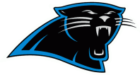
In case you haven’t heard yet, the Carolina Panthers have a new logo. It’s their first change since their foundation in 1995. If it looks the same to you, you’re not alone. There is only a few changes:
-The whiskers and eyebrows are now blue instead of white
-The black and blue border is gone
-The teeth and jaw line are curved
-The details of the head is more curved and defined overall
I’m not a huge fan of the new logo itself, but it’s so similar that there is not much to dislike. What I love is the idea to make a new logo in the first place. With Cam Newton looking more and more like the future of the Panthers, it was a good idea to sort of usher in a new era of football in Carolina. It’s somewhat reminiscent of the Lions decision to modify their logo in 2009. Detroit made a few subtle changes to their logo in hope of placing a benchmark on their miserable history of football. Now, they’re in the playoffs. Could the same happen to the Panthers? I don’t see why not.
They also changed their script logos.


